Welcome to Tellwell’s weekly Plog (photo-blog)!

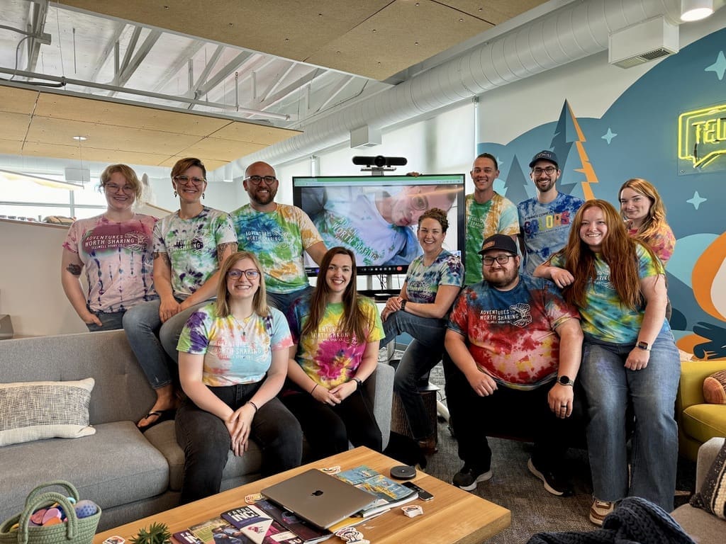
This week, we finally had everyone back in the office (hooray!). Between matching shirts and prepping for more travel, let’s see what we’ve been up to.
Tie-dye Results
In last week’s plog, we showed the process of the team tie-dyeing shirts at our Tellwell retreat. Well, here’s the moment you’ve been waiting for: the results! We had Tie-Dye Tuesday where everyone got to show off their masterpiece. It’s so fun to see the differences in color, technique, and pattern we all chose. What a colorful bunch!
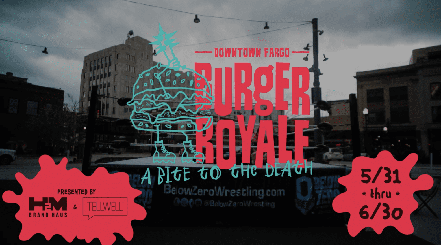
The Burger Royale Teaser is Out
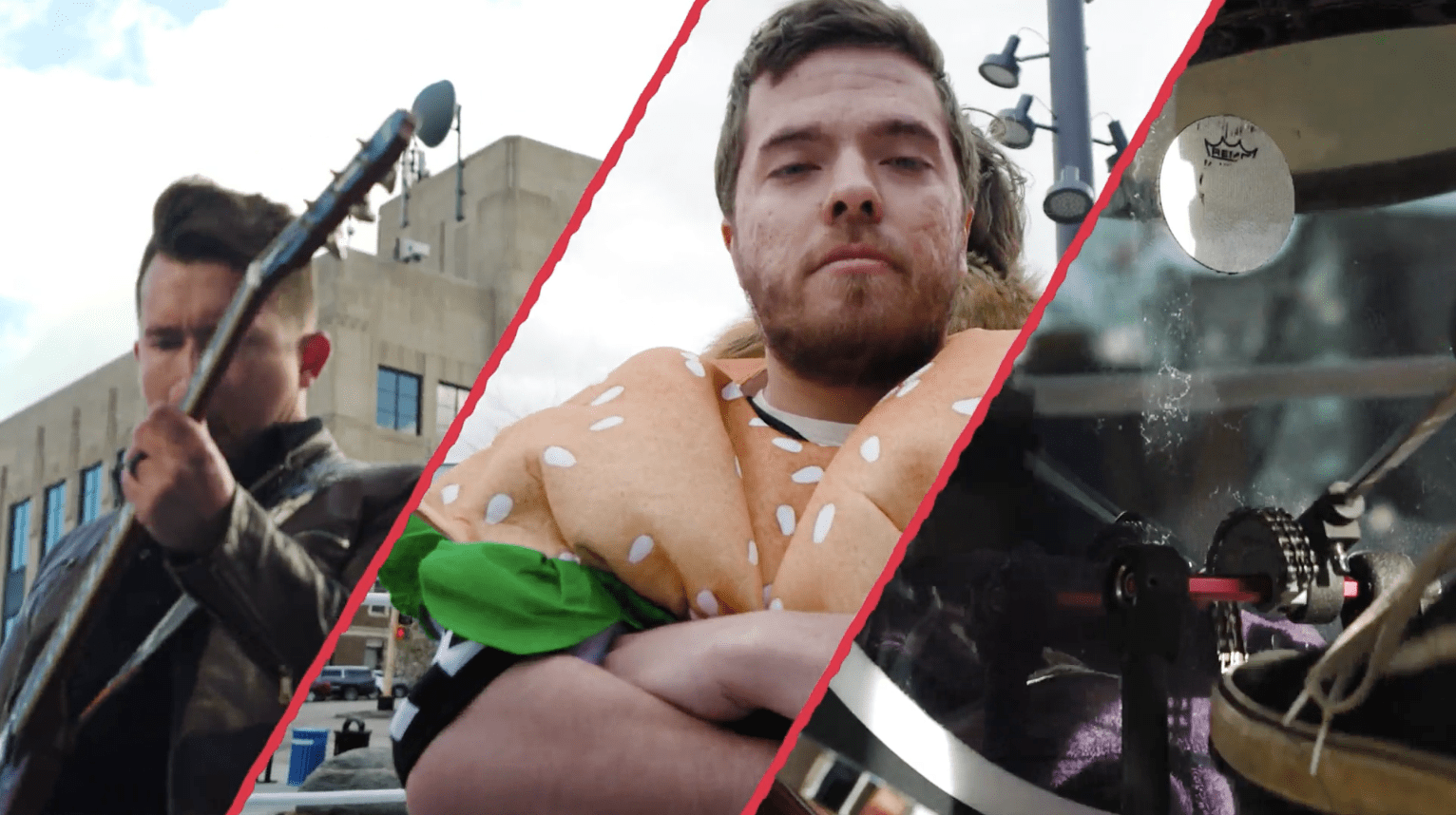
Remember that super cool music video we got to film? Teasers are starting to make their way into the world! This project has been so fun and unique, we can’t wait for you all to have the full thing! For now, here’s a glimpse into the final product. You can find the full teaser here.
Brand & Web Design Spotlight
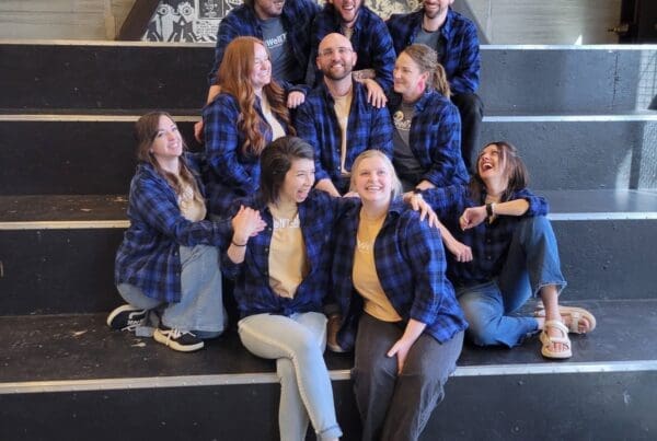
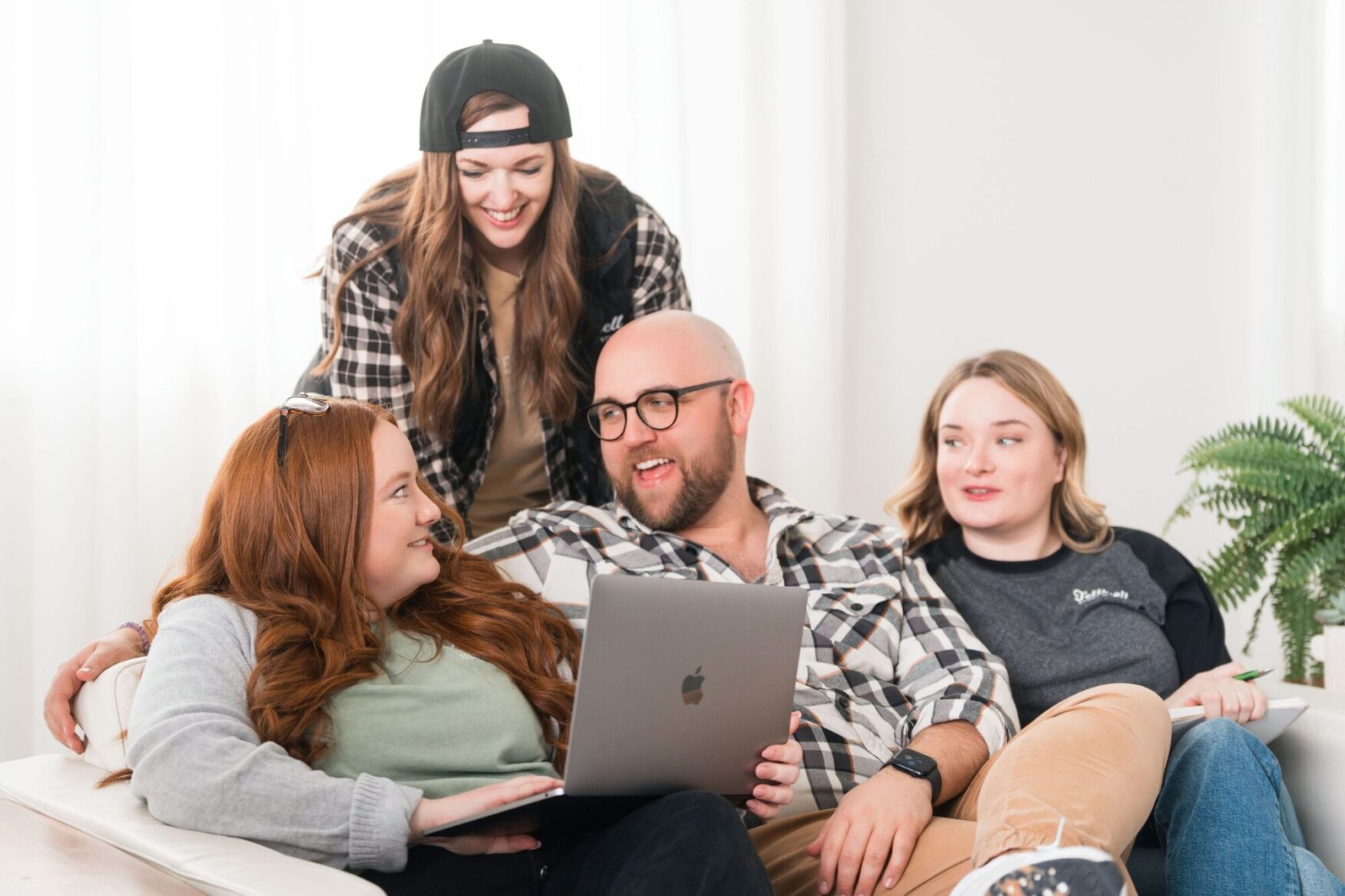
This week, we wanted to spotlight a few of our recent brand & web designs created by our talented graphic design team! Shout out to Britta the Photographer for this photo of a few of our design folks: Project Manager Megan, Senior Design Strategist Sandie, Storyteller in Chief Max, and Project Manager Emma!
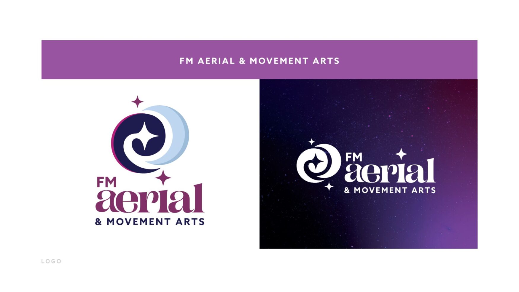
First up is FM Aerial & Movement Arts! For this guide, there was a strong foundation for a vibrant, dynamic brand. We especially resonated with their vision of fostering a safe, supportive environment for creative expression and fitness. Click here to view the entire brand guide.
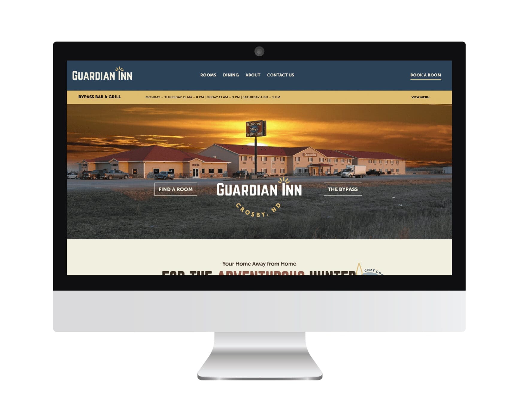
Next up is the Guardian Inn! We not only revamped the Guardian Inn’s visual identity with modern branding elements and custom iconography but also reimagined the user experience on the website. The Guardian Inn experienced a significant boost in its visual and web presence, leading to enhanced customer engagement and solidifying its position as a premier destination for travelers in Crosby, North Dakota. Click here to view the entire project.
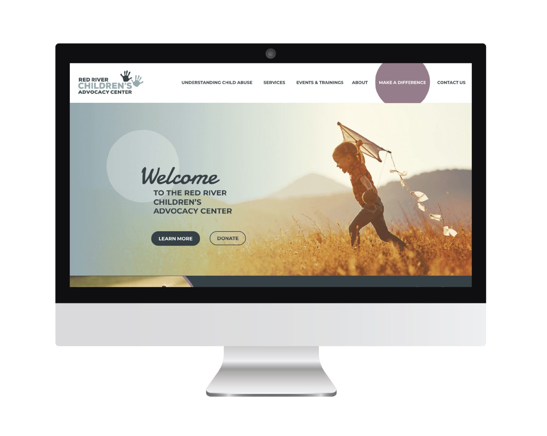
Lastly for this week’s spotlight is the Red River Children’s Advocacy Center (RRCAC)! Our focus was on addressing the outdated visual elements and the poor user experience of the existing website. In the end, this elevated the brand identity and improved user experience on the new website substantially. Click here to view the entire project.
That does it for this week! Keep an eye out for the next plog, coming June 7th!
