A New Evolution

In 1951, Reservation Telephone Cooperative (RTC) was formed with the goal of providing low-cost, high-quality telephone service to the residents of northwest North Dakota.

In the 70 years since their founding, Reservation Telephone Cooperative has evolved to meet their community’s needs, expanding to 20 exchanges over a 6,000 square mile area and including new services beyond telephone such as internet, television, and surveillance.

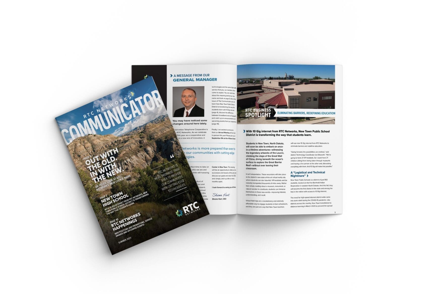
But, much has changed over the past seven decades. They have always been a progressive organization by continually updating their services – so the Board of Directors felt it was time to update their branding as well. That’s where Tellwell Story Co. came in.

The Process

We wanted RTC Networks to be recognized as the provider of choice in their community. They were really looking forward to something fresh, based on feedback from their board and loyal RTC members, and knew that without it they would be missing out on engaging with their members. It’s just wrong that they felt that way, as their impact in the community should not go unshared.

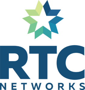
The new logo consists of the wordmark and a symbol: five arrows joined in a circular pattern. Together, these arrows create a negative space called the Connected Star.

The Connected Star is an homage to a star network topography, in which every host is connected to a central hub of a start network. RTC networks is proud to be the communication hub for the region, connecting all of the communities to each other, and to the world.

RTC Networks – Brand Reveal Film

In order to celebrate their new brand and their decades of history, we created a brand reveal film with RTC to educate their audience on the new change, and remind their community why they love them!

Ready to refresh your brand?

Contact us!