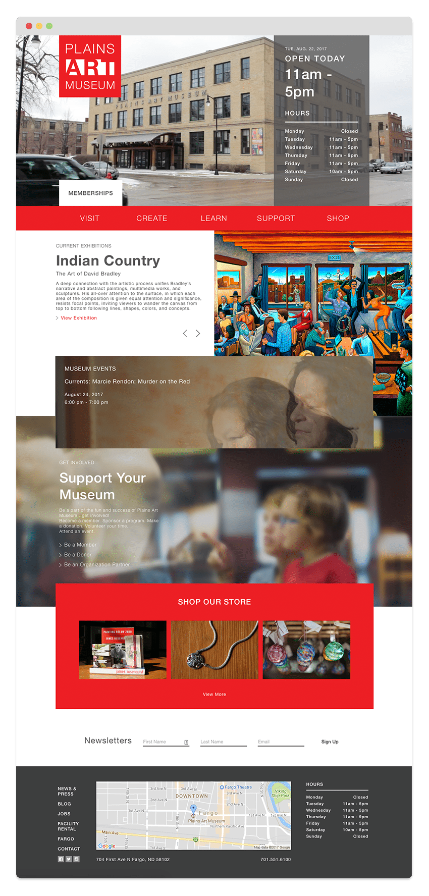
When we first met with Plains Art Museum (internally known as PAM), their website was built in the early 2000’s, and was actually a series of five different WordPress sites, all put together to appear as one site. The complexity of the site made it really difficult for patrons, donors, and actual staff. It was hard to find info, hard to register for classes, hard to give a donation, and next to impossible for staff to update the website.
We wanted to create a new web presence that was highly customized. When you go into the museum, they have cutting-edge galleries, new and modern exhibits, and a beautiful space. The goal was to replicate this online. The new website would be a user-friendly and approachable space, just like the museum, and would get people where they needed and wanted to go.
One of the snags/opportunities that we ran into was that they wanted to use the new site as a catalyst to rethink/reintroduce how they did events, classes, and donations. As we developed the initial design built most of the site, they started the process of looking for a new CRM, donor management system, and class registration system. We pressed pause on our process — originally a 12-week timeline — so that we could fully integrate those new systems as a part of their new site. Several months later, they chose their tools and we helped them integrate those prior to launching their new site.
The site was completely custom because we wanted to take some calculated risks and artistic liberties in creating a user experience that was uniquely specific to the Plains Art Museum.
We worked with our development partner, Codelation, to execute on the custom web experiences that were integrated throughout the site.
We used their existing brand as inspiration for the site’s design. The Plains Art brand has been very strong since they first came to the scene. Since its inception, a red box has become synonymous with Plains art in Fargo. We used the architectural features of the museum as design themes throughout the site: it’s boxy, it’s geometric, and it all fits together

