My name is Emma and professionally speaking, I’m a Graphic Designer. I’ve been doing this graphic design thing for about 6 years, and I’ve learned a few lessons from a variety of people along the way. Here are some notes from a graphic designer, some only half-thought-out, that I hope come in handy the next time you press File<New.
1. If you don’t have inspiration, you have nothing.
2. When something is designed well, you won’t notice it.
- Think of the last time you did some online shopping. Was the process smooth and effortless? Were you tempted to buy more than you needed because it was so easy to find things and confirm your order? Or did you struggle to arrive at what you needed, and run into issues as you were trying to check out? These two very different experiences rely on how well-designed the user experience was. You only really reflect on the UX when it’s bad because it made you think of how it could have been better.
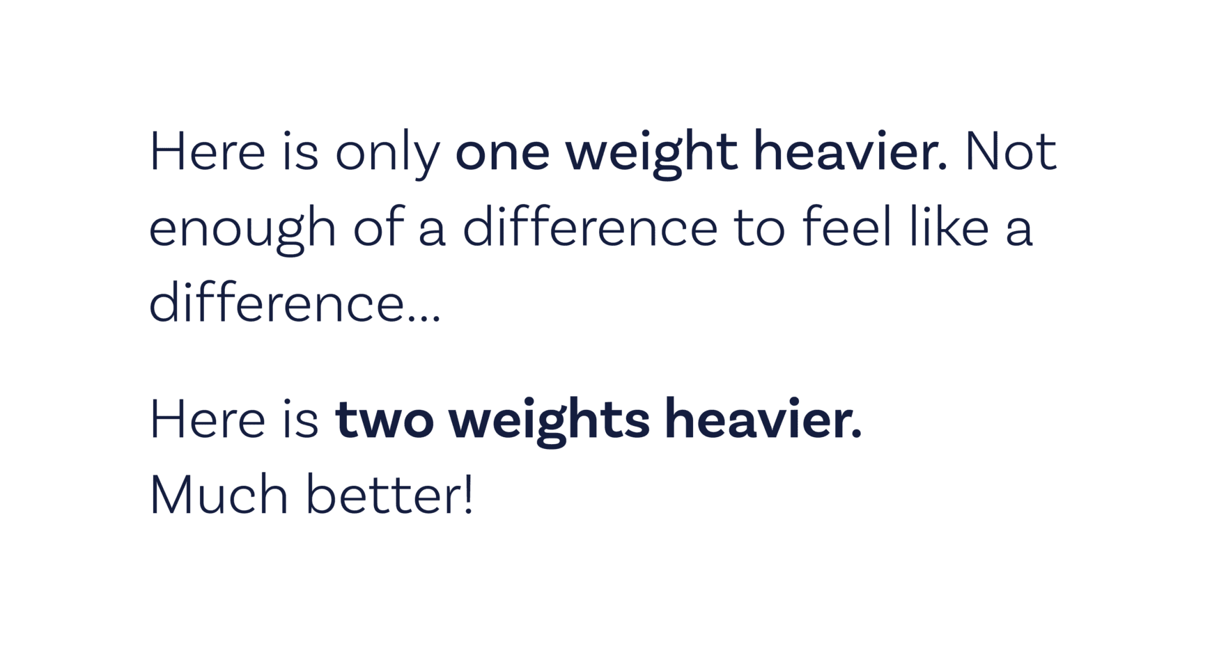
3. Generally speaking, you need to bump the weight of a font by two, or else there isn’t enough of a difference to notice.
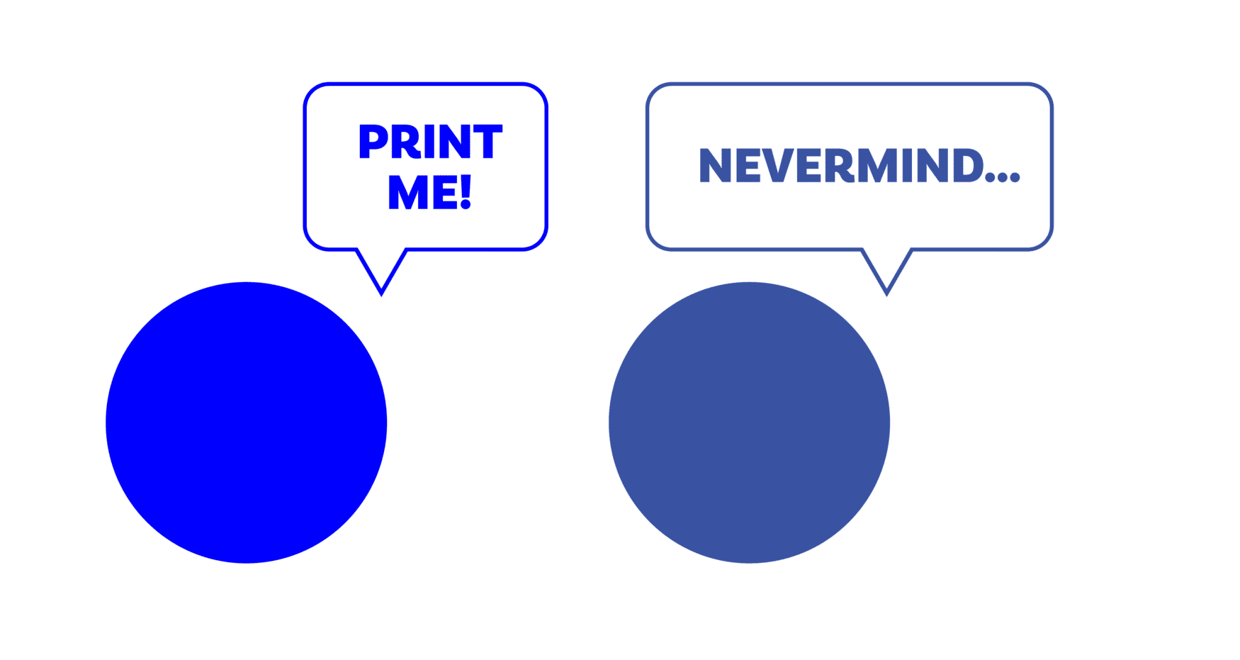
4. Design your logos first in black and white. If it doesn’t look good without color, it won’t look good with it.
6. Don’t do the obvious. Give people something to think about.
- Does a brewery logo need an icon of a hop in it? Does a roofing company need a roofline? Sometimes, yes… but probably not. Look for a new story to represent visually. Like a siren begging you to drink her coffee, or a golden arch saying you need fries, stat.
7. Not everything needs to have a purpose. Sometimes things can just look good because they do.
8. Changing up the color of something doesn’t count it as a completely different concept.
9. Don’t pollute the environment, or your desktop.
10. Don’t always use your logo font as your heading font.
11. Spellcheck. Spellcheck. Spellcheck. With a computer and a human.
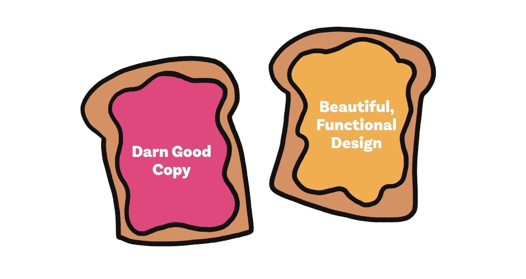
12. Copy + Design go together better than PB + Jelly. They depend on each other to be great.
13. When something doesn’t feel right, it probably isn’t (in both life and design).
14. Don’t use the same two fonts for everything. There is so much more out there. Go explore!
15. Use Pinterest sometimes, but also Behance, Dribble, personal and agency portfolios, your surroundings….
- Utilize everything in your environment to inspire your design. Art can’t be made in a vacuum, and I often find inspiration or ideas in some of the oddest places. You never know what you’re going to find!
16. Don’t pigeon-hole yourself to one style. If you find one that works for you, go for it. If you can chameleon yourself into multiple styles and processes, do that too.
17. You don’t need to be an illustrator to be a designer. These are very different things.
18. Get the rules down before you break them.
19. When someone asks why you did something, it’s ok to not have an answer.
20. Design is intuition more than it’s learned.
- But you can learn to have better intuition. To better your intuition: observe what you like, understand why you like it, and do something in a similar way. (But don’t be a copy-cat).
21. Sometimes things should be aligned optically, instead of mathematically.
22. When someone asks you to make something POP! or be a little extra, ask yourself what they’re actually missing in the design before going overboard with details.
23. Be nice.
24. Everyone is a designer in their own right.
25. Not every brand needs to have a pattern or a texture. Type-dependent or photo-dependent brands are cool too!
26. Be wary of a re-bland. Rebranding should be done with care. We don’t need anymore logos that look like every other L O G O.
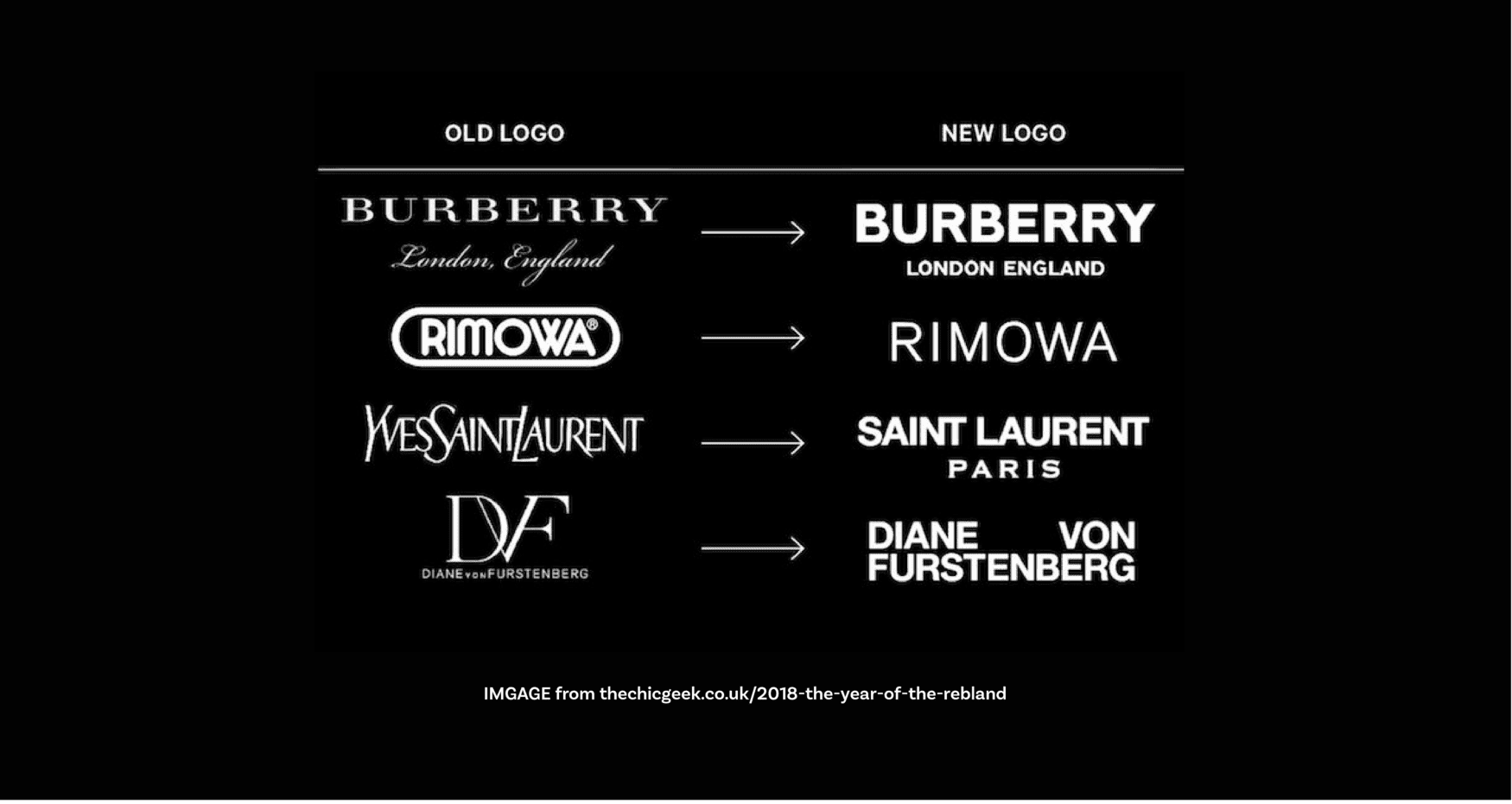
27. Don’t drop a vowel and call it L O G O. These brands don’t last.
28. Read books about design. (Even if you don’t read them, they make you look cool when sitting on your bookshelf).
29. Tell your friends you’re a designer. Design things for them when you have the time. Make them pay for more design work when they hit it big.
30. Learn how to design data. If you can interpret confusing data and numbers, you can lay out anything anyone ever throws at you.
31. Ask for help when you need it.
32. Everyone wins when you have the same standards.
33. Everyone wins when you have the same goals.
34. Design isn’t brain surgery, but it does help explain it in infographic-form.

