BAND, the Broadband Association of North Dakota, represents members of the independent broadband industry from across North Dakota. It’s a commitment to providing state-of-the-art telecommunications for our state — from rural farmland to small businesses. As BAND, we understand that having a reliable, high-speed connection is no longer an accessory, but a necessity. And we are working tirelessly to ensure all of our residents have the connectivity they need.
This new branding represents these values and commitments. It showcases our North Dakota roots and provides a bold name that represents the strength of our organization. Together, BAND is poised to forge ahead towards the future, rooted in our strong Midwest values, with the innovative approach that has kept us at the forefront of technology for North Dakota since 1953.
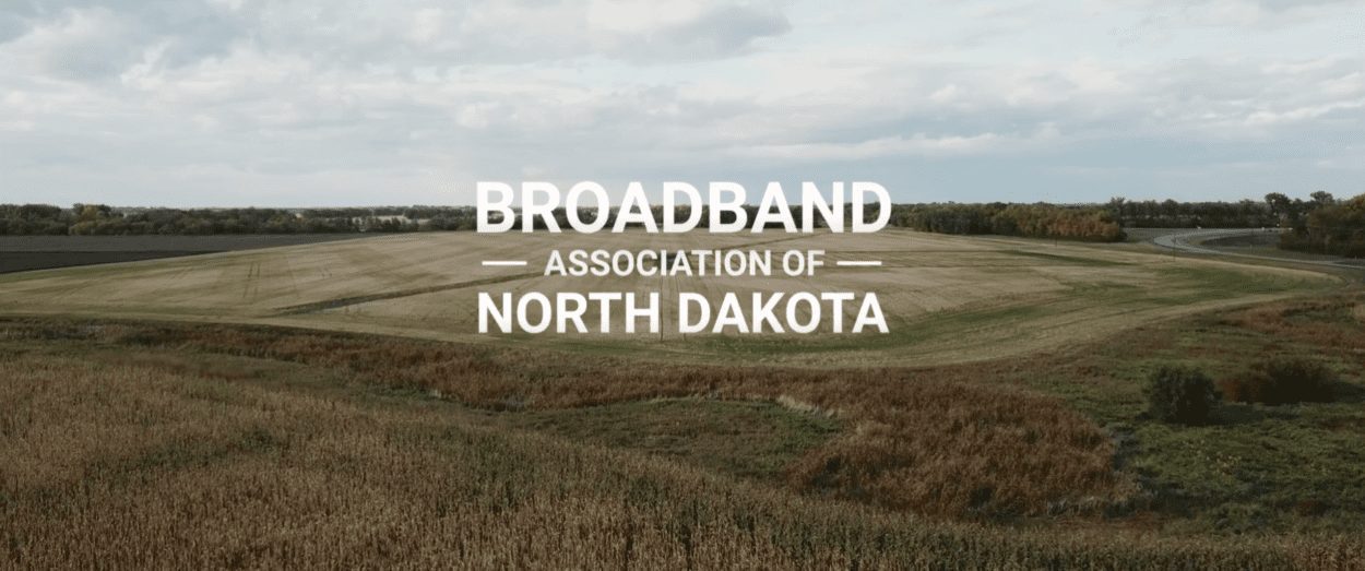
In a name and a look
North Dakotans are proud to be North Dakotan. Whether your home is in the country, a small town, or a city, we all share common ground. A rock-solid work ethic. A shared “I got your back” mentality. The preparation that comes before winter, and the celebration on the first warm day (in May…) Maybe even a signature recipe for tater tot hotdish.
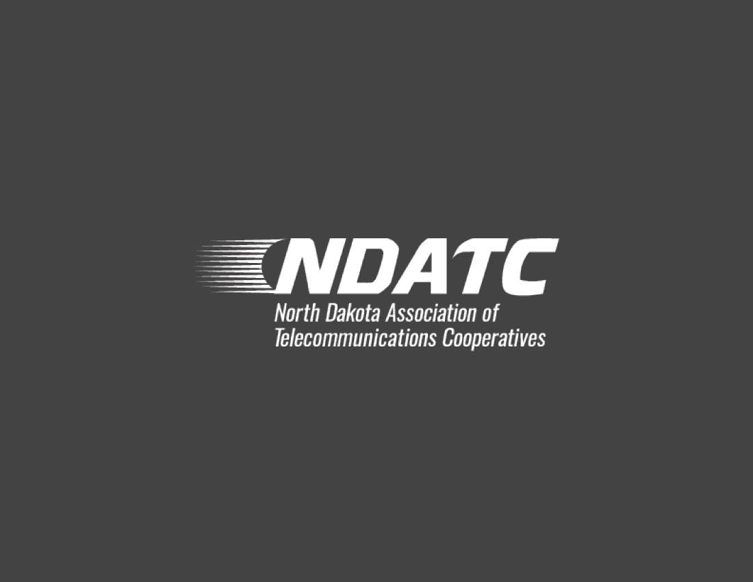
Between the ‘I got your back’ mentality and the impressive infrastructure member organizations have created, The North Dakota Association of Telecommunication Cooperatives was not only cumbersome to say but also outdated. The phone companies of yesteryear are now full fledge tech companies selling broadband more than phone service, and the organization that represents them needed to reflect that.
Introducing the
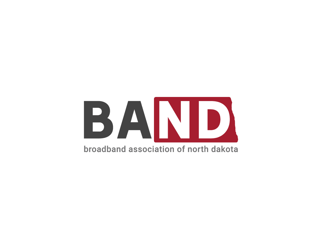
Broadband Association of North Dakota (BAND)
The members of BAND know North Dakota in a uniquely comprehensive way. It allows every customer to be a local, every community to be connected. At the same time, each of the sixteen telecommunication organizations have the strength of being united as one — as BAND; just as we each come from our own unique hometowns, but are united as North Dakotans.
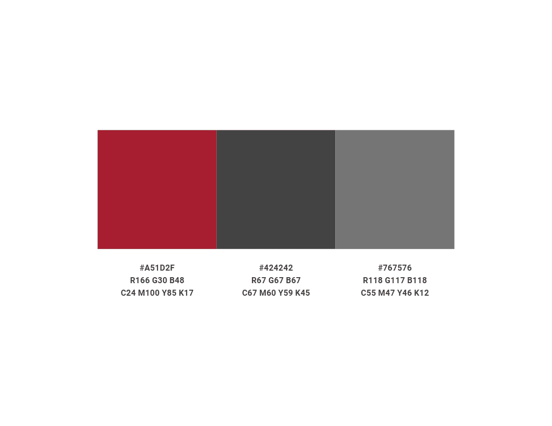
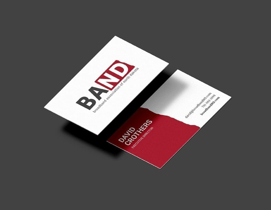
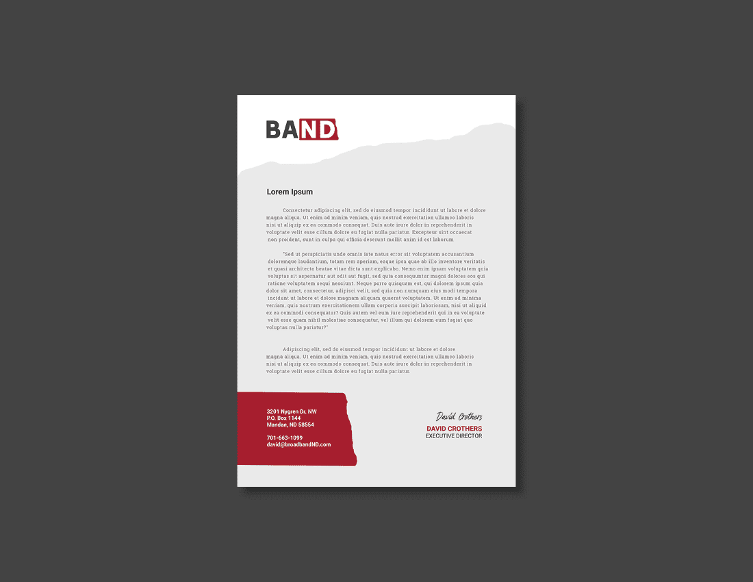
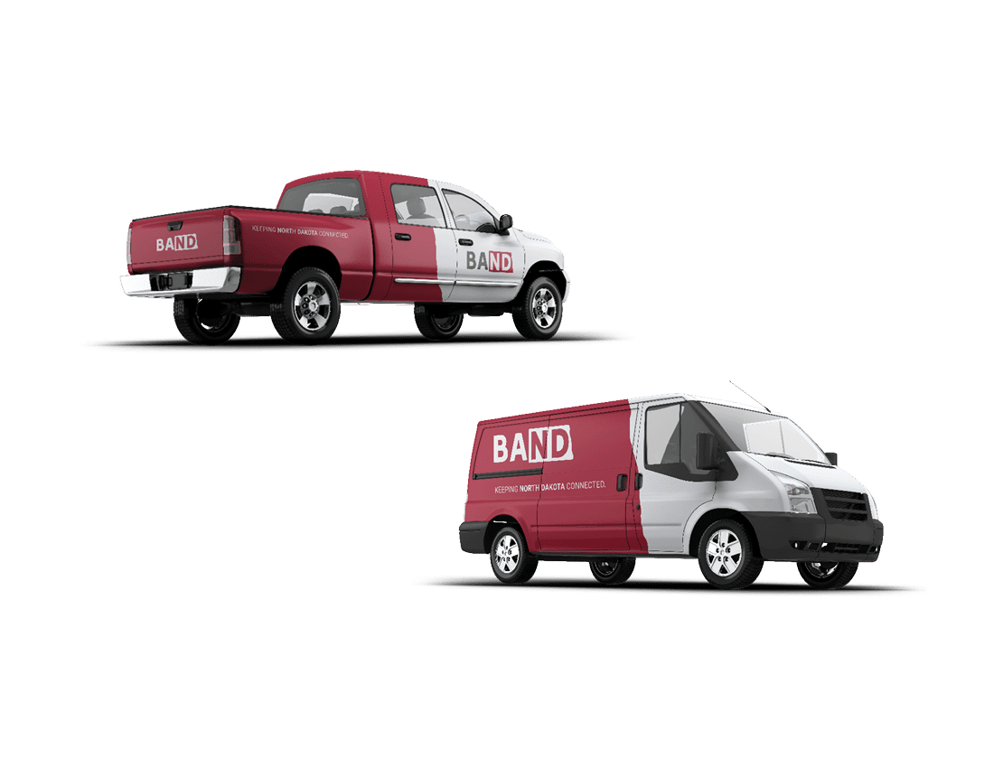
This visual concept is a proud nod to BAND’s North Dakota roots. By using the shape of North Dakota’s state outline to highlight the “ND” in “BAND,” we are creating a signature look that fosters a sense of loyalty and local love with customers. We use bold, capital letters, and a sturdy typeface that is clean, simple, and highly readable, to communicate the down-to-earth mentality that is characteristic of North Dakotans. Dark blues paired with light grey and off-white create a minimalistic look; simple and straightforward. You might know a few folks who fit that description.
In many aspects, this concept is a nod to the old while stepping into the new; a fresh look that still showcases BAND’s long-lasting history as a reliable, homegrown organization. North Dakota grown, and North Dakota true.

Launching a new brand
Introducing a new brand to the market is hard. Luckily, we were quickly approaching state tournament season and in North Dakota – the Class B Basketball tournaments are the Super Bowl for advertisers in North Dakota.
Having worked with several of the local broadband companies that are members of the association, we were able to repurpose some of their footage to put a couple of commercials together for the ‘state b.’


A brand that works
The biggest opportunity and challenge with the BAND brand was that it needed to work for every organization that was a member in addition to the central staff. This brand is simple, effective, and able to be utilized as a co-brand for each member organization.
Do you have a branding project that could use some strategy, some visuals, or some love? Give Tellwell a try.