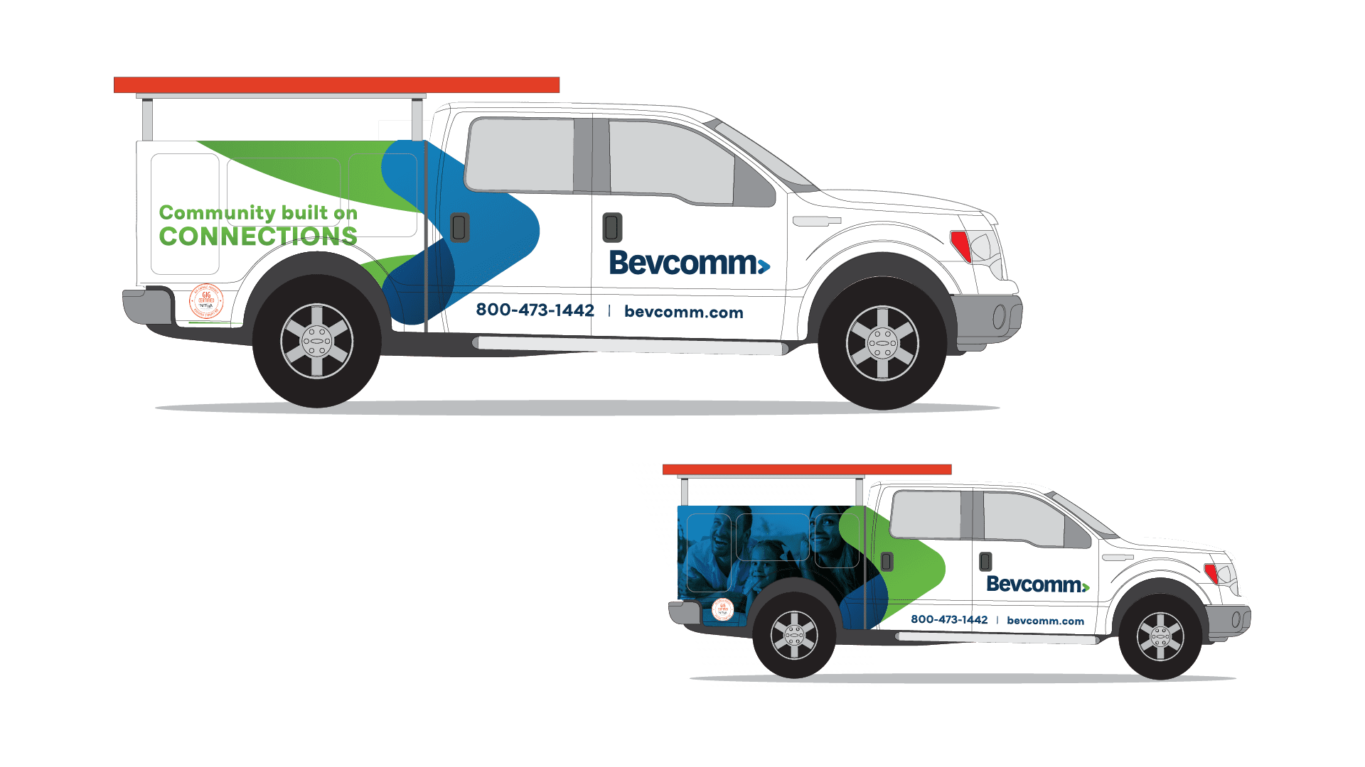
For four generations, Bevcomm’s commitment to providing their customers with cutting-edge communication technology has never wavered. However, the industry has evolved over the past 125 years, and so has Bevcomm—and it was time for their brand to do the same. That meant a complete refresh, with a new logo, new brand colors, and more!

Bevcomm
A New Brand for a New Day


What’s in a name?
The first change we made to Bevcomm’s brand was the company’s name. When they enlisted us, Bevcomm went by the all-caps BEVCOMM. While capitalized names reflect authority and strength, they can also make a company appear outdated or stuck in its ways. Lowercase names (think Apple, Amazon, Airbnb…) are associated with innovation, playfulness, and creativity. We believe that the lowercase version, Bevcomm, can position itself amongst the ranks of these innovative brands and technological pioneers. This fresh new name more accurately fits the progressive, modern, end growing company they have become!
Once the Bevcomm team had bought into their new name, we could proceed with turning it into a sweet new logo. The “Bevcomm” word mark is followed by a modern, minimalistic arrow icon.
Bevcomm – Brand Reveal Animation
Bevcomm had an exciting new brand and wanted to show it off, and we wanted to help them do so. We created this animation to help them show off their new colors, logo, and branding in an exciting, fresh way.
Forward
Progress
Arrows are a sign of motion, of forward progress, and that’s what Bevcomm is all about: constantly moving forward and staying on the cutting edge of communication technology in order to provide their customers with the best possible experience.
By combining Bevcomm’s existing brand colors with color psychology research, we also developed a vibrant color palette for use in their logo, website, and branded materials. The basis of this palette is three shades of blue, which convey professionalism, loyalty, and security. These blues are accented with two bold secondary colors, Prairie Green and Energy Orange, to keep things fresh. Finally, we equipped the Bevcomm team with a detailed Brand Style Guide—complete with typography, three alternative logos, and stationery—to help them put their new look to work.

