Four Decades of Memories in a Hand-Drawn Mark
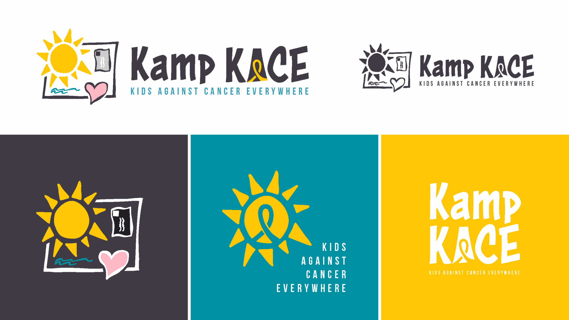
For nearly 40 years, Kamp KACE has been a place where kids with cancer and their siblings get to feel like kids again. Its logo, drawn by a camper decades ago, carried the heart of that mission. But as time went by, the beloved mark became harder to read, harder to use, and not always recognized for the vibrant community it represented.
As one counselor put it: “That mark carries our memories. It can’t just be replaced.”
Listening First, Designing with Care
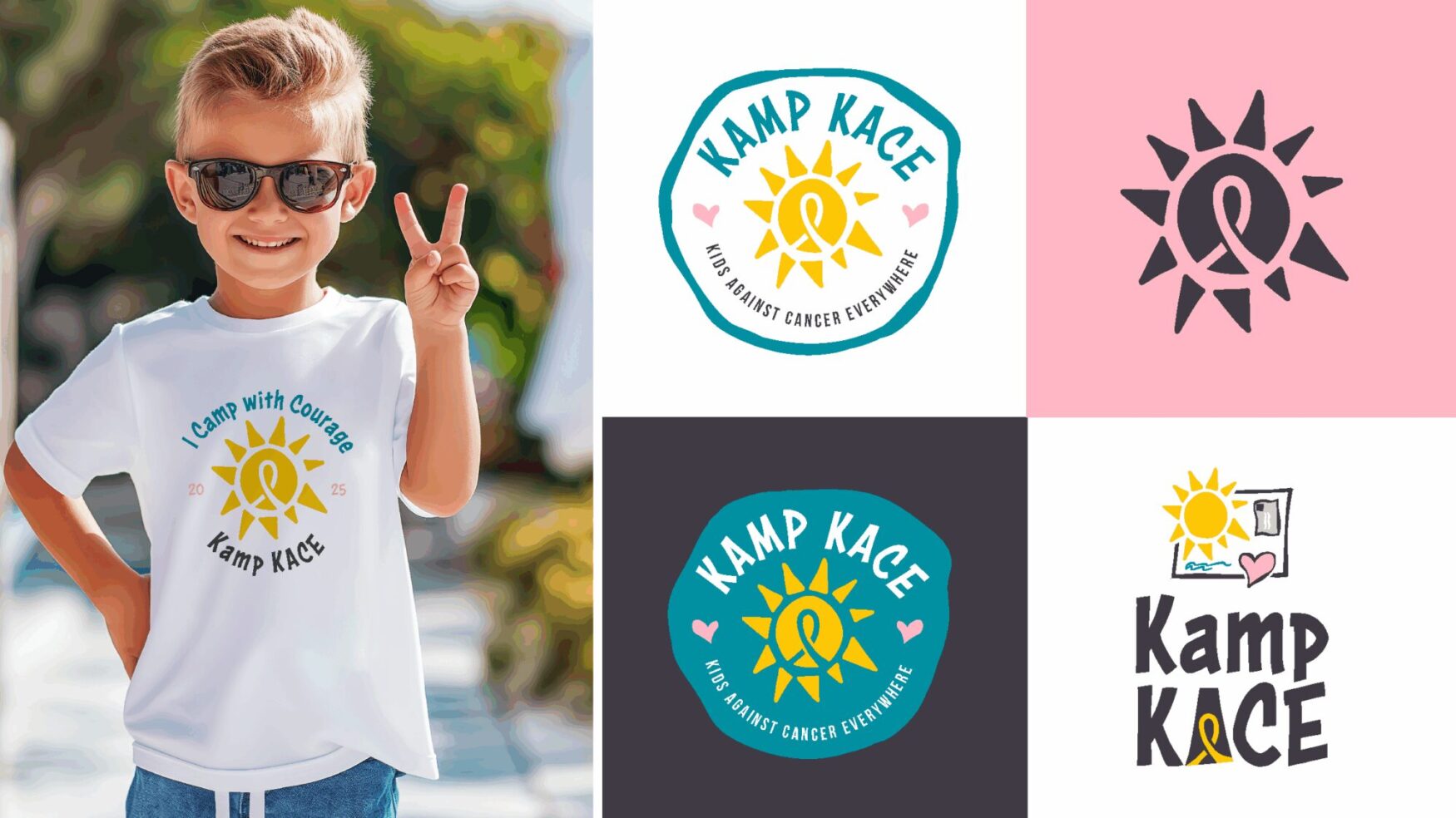
When Kamp KACE partnered with Tellwell, the goal was clear: refresh the brand while protecting its soul. That meant careful listening, collaborative exploration, and a promise to keep the core elements—the sun, the water, the spirit of joy—intact.
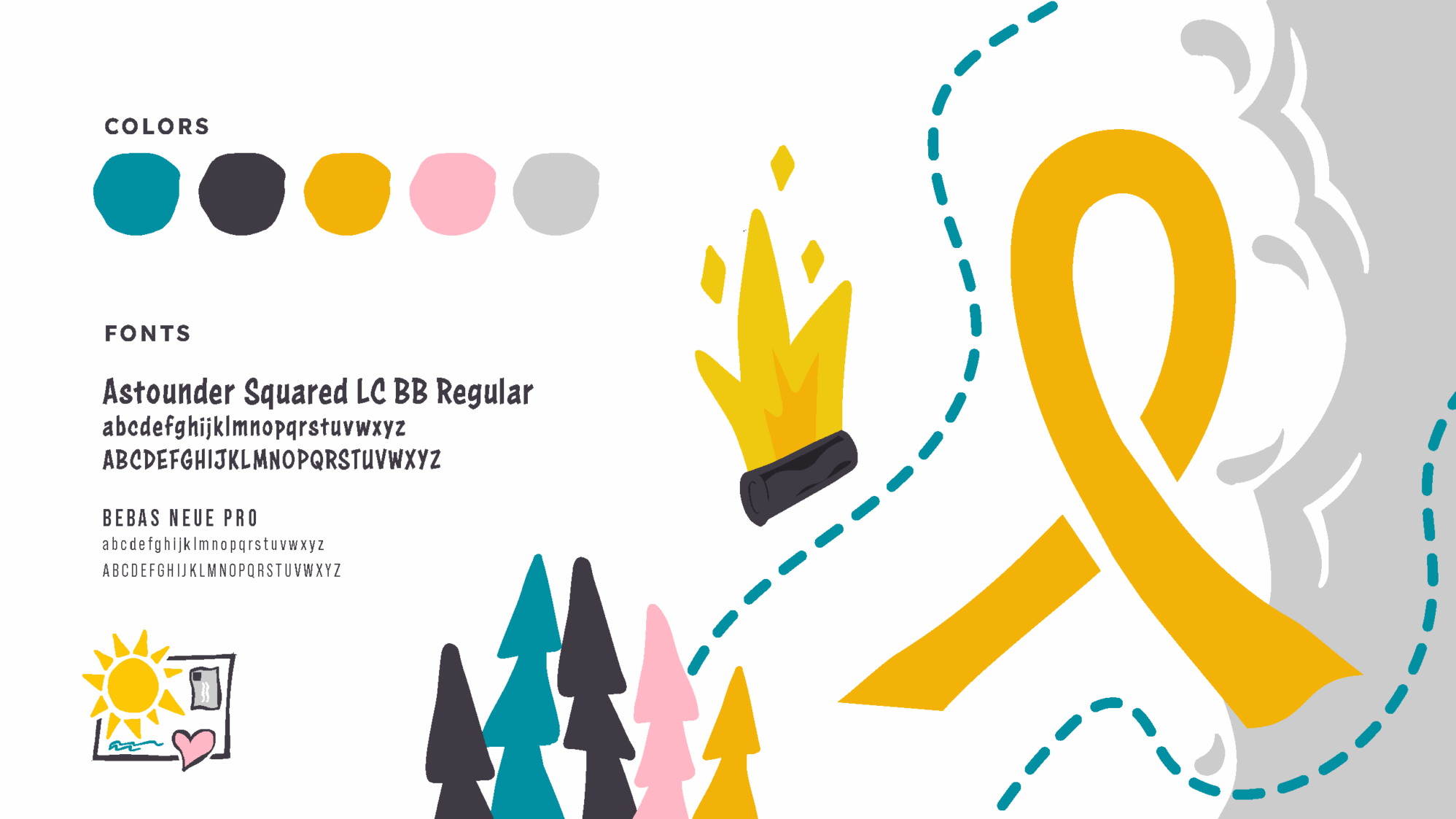
The team introduced a refined color palette, including gold to honor childhood cancer awareness. They reimagined the typography for legibility without losing warmth. And they developed brand elements that reflect camp life, including the campfire and cabin, that speak to both adventure and belonging.