Nonprofit Website Redesign: Red River Children's Advocacy Center
Red River Children's Advocacy Center: Brand Refresh & Website
The Red River Children’s Advocacy Center Brand Refresh & Website project was spearheaded by our team with the aim to modernize and enhance the organization’s branding and online presence. Recognizing the need for an updated visual identity and a more navigable website, we implemented a comprehensive visual refresh package, which included the creation of a new brand style guide and variations of the logo. This was complemented by a redesigned homepage, new site styling, and templates for interior pages, all crafted to improve user engagement and accessibility.
In tackling the project’s challenges, our focus was on addressing the outdated visual elements and the poor user experience of the existing website. To this end, we conducted a thorough content audit, offered strategic recommendations, and developed fresh content that better reflects the advocacy center’s voice and approach. Additionally, our technical solutions included the deployment of Forminator, a robust form building tool that integrates seamlessly with Salesforce to enhance user interactions and data management.
The results of this project were significant, yielding an elevated brand identity and a substantially improved user experience on the new website. These enhancements have not only strengthened the center’s community presence but also streamlined their communication and service capabilities. This project stands as a testament to the power of thoughtful design and strategic web development in transforming an organization’s digital footprint and overall effectiveness.
ProjectOverview
Our team embarked on a comprehensive project to revitalize the branding and web presence for the Red River Children’s Advocacy Center. The goal was to modernize their visual identity and create a user-friendly website that reflects the center’s vital role in the community.
TheChallenge
The challenges we faced were an outdated look and feel for the visual branding and webdesign, along with a website that was tough for visitors to navigate easily.
The Solution
We tackled the challenges with a few key solutions:
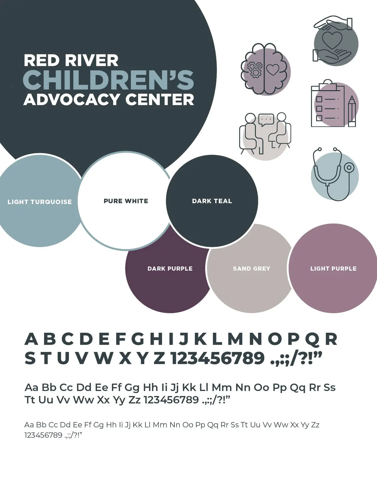
Visual Refresh Package: We developed a fresh brand style guide and updated logo variations to modernize the look.
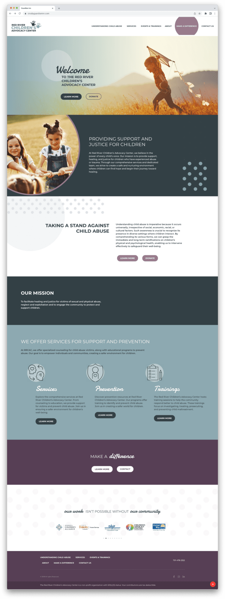
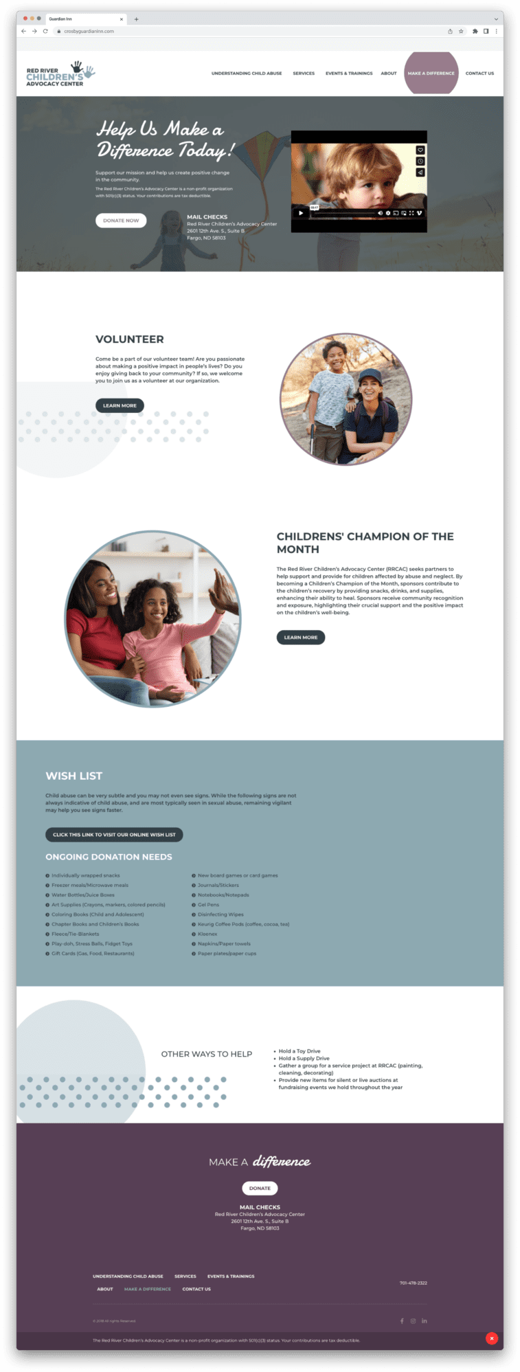
WebDesign: We rolled out a new homepage design, improved site styling, and created templates for interior pages to make the user experience smoother.
Content Auditing and Copywriting: We revamped the existing content and crafted new, impactful pieces to better represent the center’s mission.
Form Development: We integrated powerful form-building tools that connect with Salesforce, making it easier for users to interact with the site.
Enhanced Brand and User Experience
Throughout the redesign process, our goal was to elevate the brand identity to resonate more strongly with the community. We aimed to significantly improve the website’s usability and aesthetics, enhancing the overall user experience. With these improvements, we strive to empower the organization to strengthen its presence, drawing in more visitors and fostering deeper engagement through a more user-friendly interface and a visually appealing design.
Visual Transformation
Experience the transformation of RRCAC with a refreshed brand identity that brings a modern and cohesive look to the forefront. Explore our brand style guide snapshots, showcasing the meticulous attention to detail in the new logo variations and iconography. See the dramatic improvement through before and after screenshots of the website, highlighting the enhanced user experience and aesthetic appeal.
At Tellwell, we’re dedicated to helping organizations like RRCAC tell their story through compelling visuals. Let us help you elevate your brand to new heights.
Ready to become the next story?
The best case stories start with a conversation. Tell us what you’re working on and we’ll tell you what it could look like.