Case Story

Redefining Life After Loss

Haven

The idea for Haven was born in 2017 out of a desire to organically and authentically connect with other parents. To talk about the hard stuff without fear of judgment or discomfort. To honor ourselves, each other, and our children.

Haven approached us early in 2022 looking for a refresh of their branding as they advance into the next stage of their strategy. We equipped them with logo, brand elements, colors, fonts, and so much more.

Today, Haven supports grieving parents by providing timely, comprehensive educational resources; hosting events focused on self-care and healing; and curating and delivering heartfelt Healing Gifts. In the midst of loss, Haven is a safe space for us to love children–and one another–out loud. Join as we grieve, celebrate, and walk the long path to healing together.

Haven circular badge logo with "Hvn." and the tagline "Redefining Life After Loss"
Haven logo with the tagline "Redefining Life After Loss"
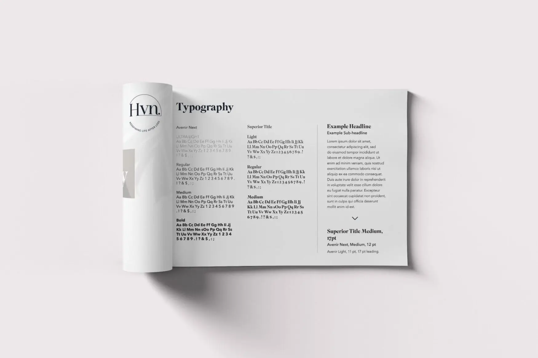
Haven brand guide page showing typography samples
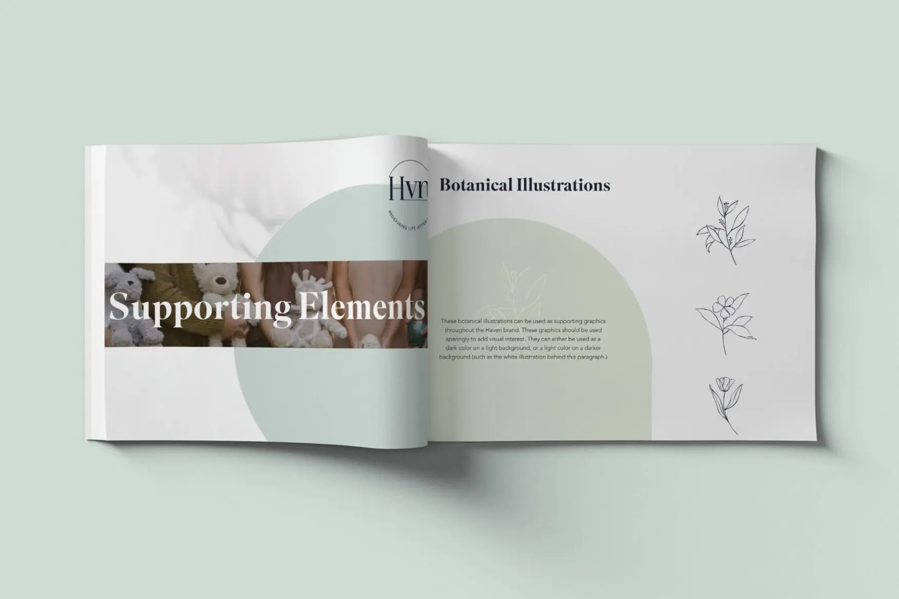
Haven brand guide spread on supporting elements and botanical illustrations
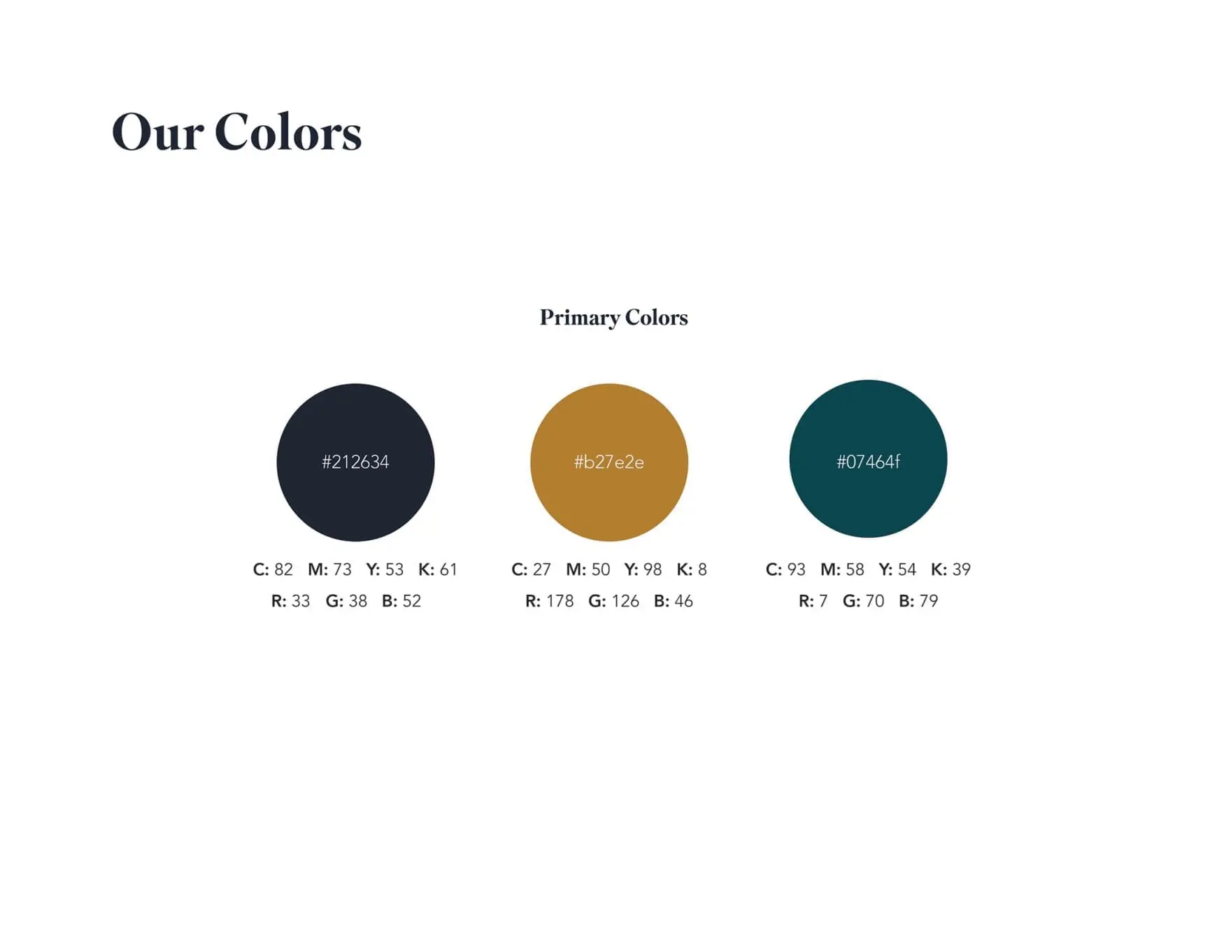
Haven primary brand colors: dark navy, gold, and deep teal
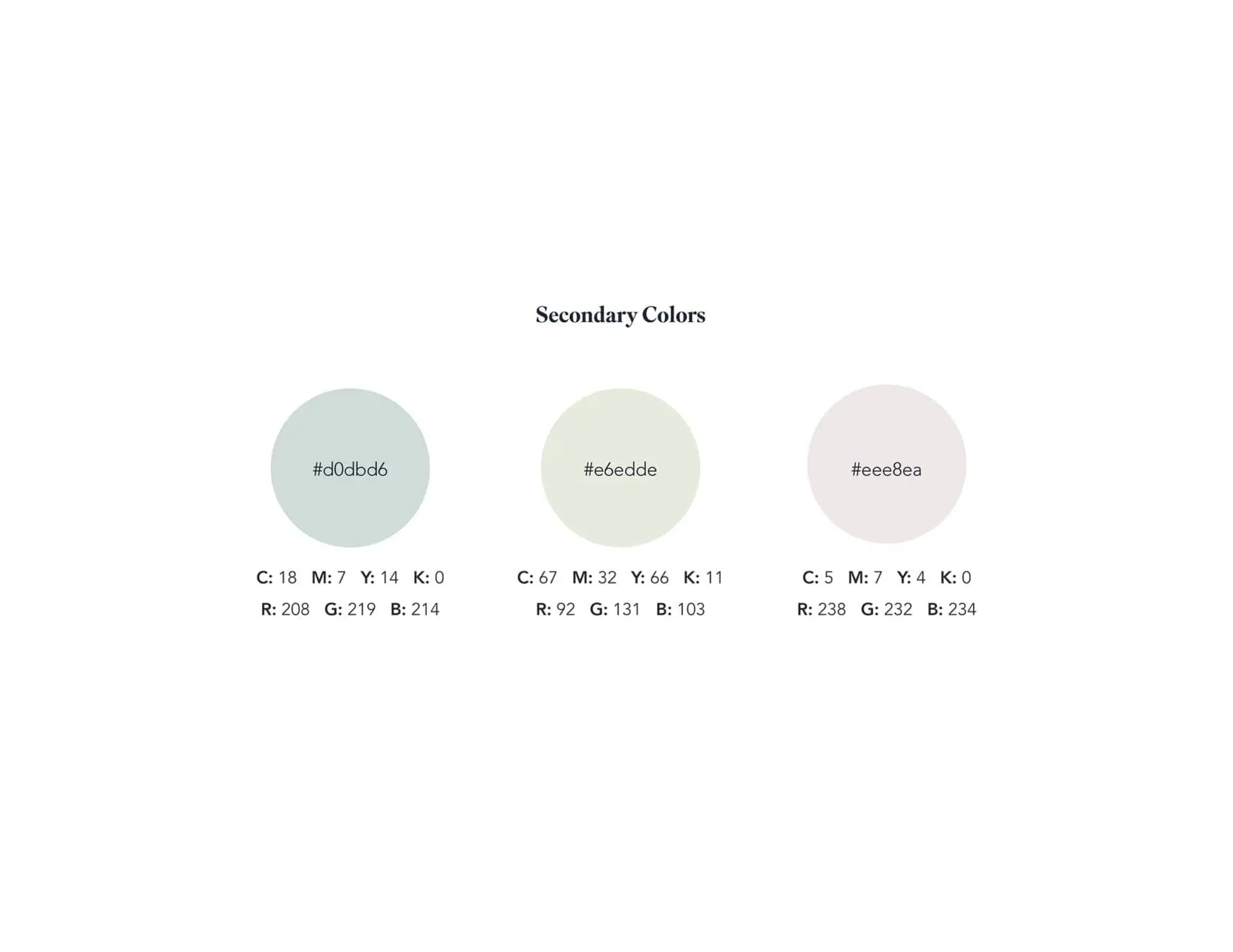
Haven secondary brand colors: pale sage, light green, and soft gray
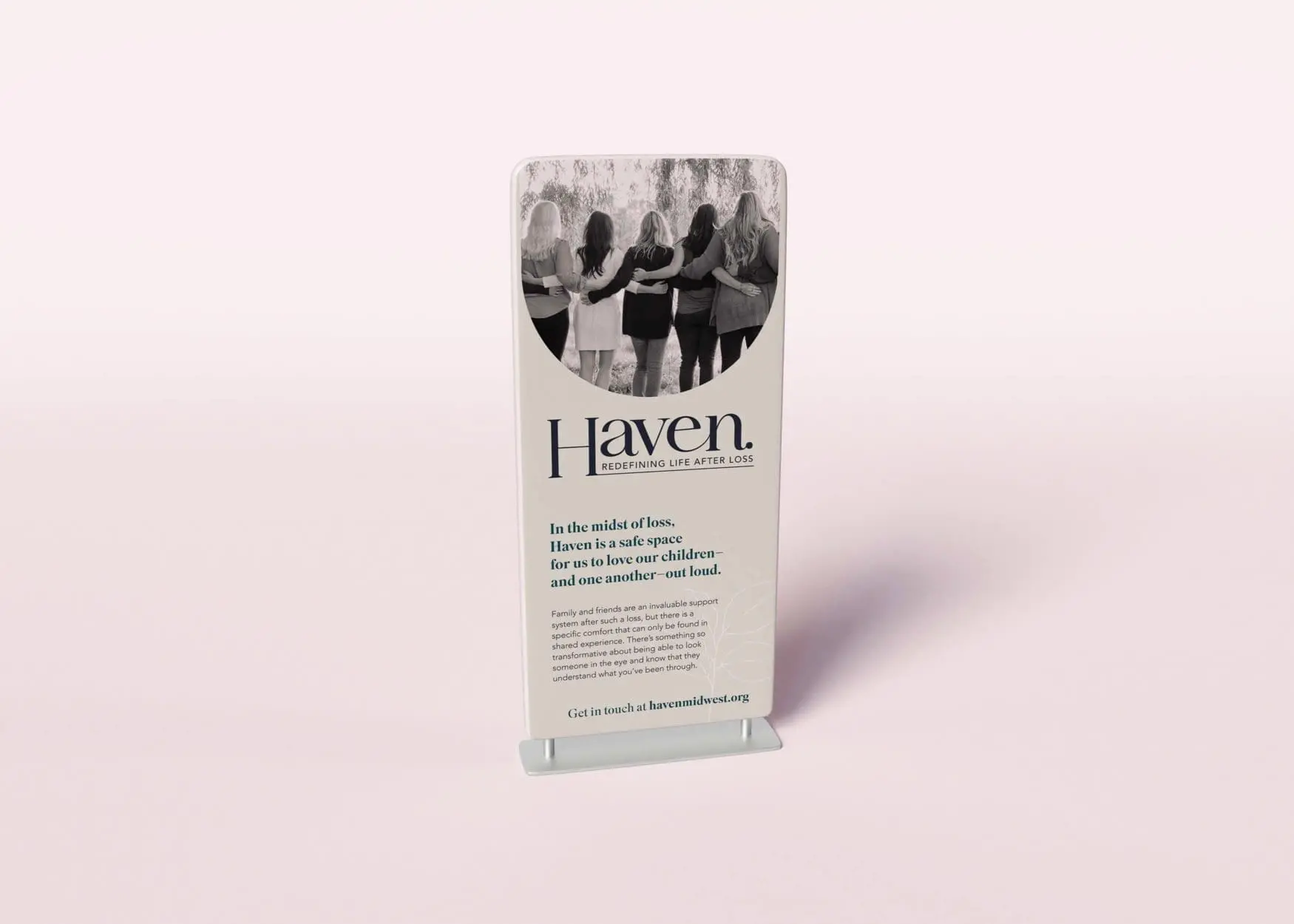
Haven tabletop sign with a photo of women arm in arm and the line "In the midst of loss, Haven is a safe space"
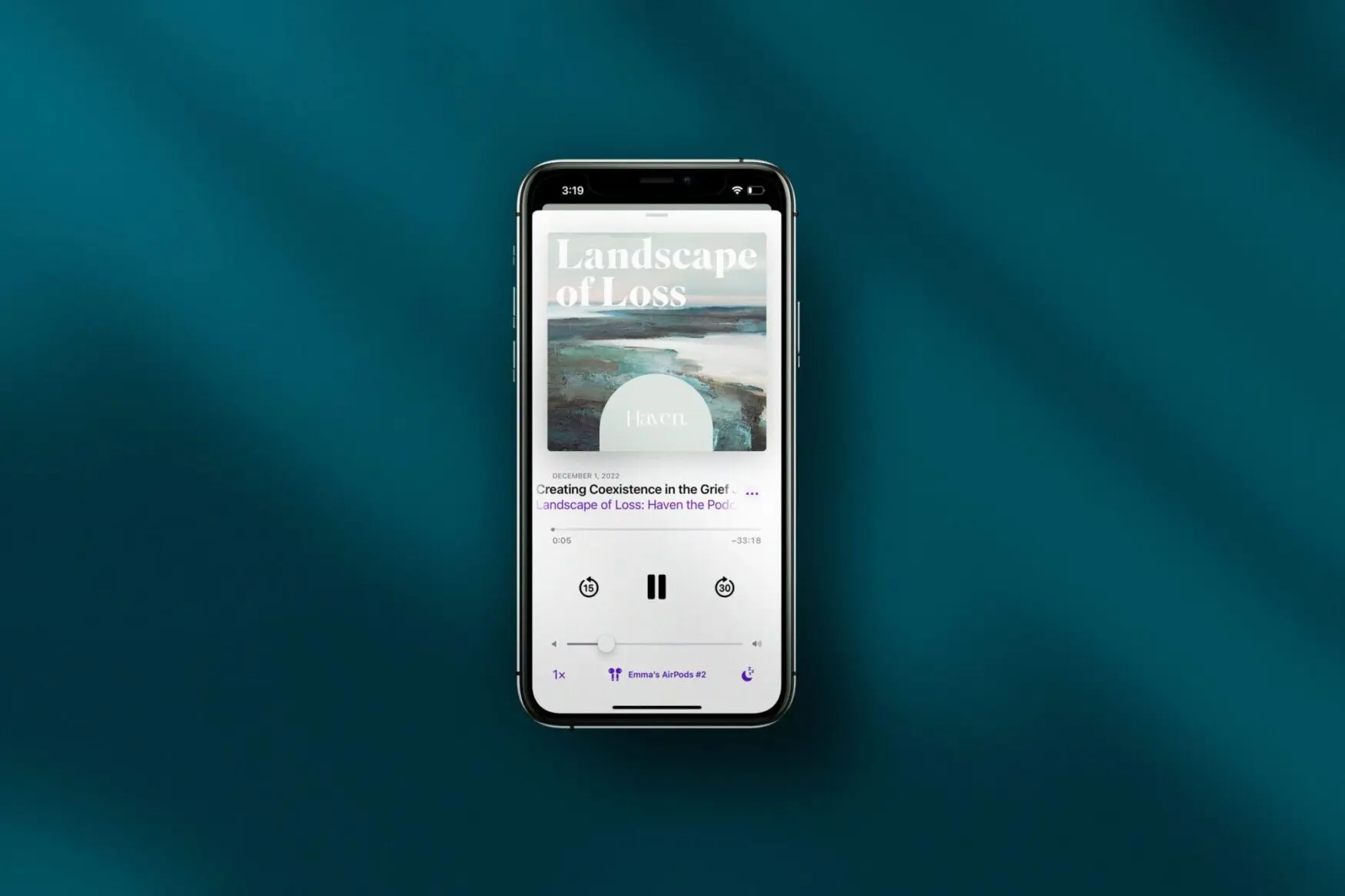
A phone playing a Haven "Landscape of Loss" audio episode
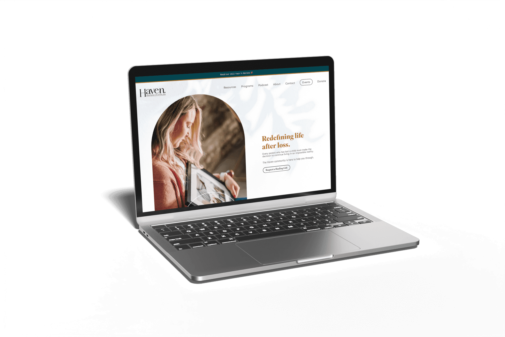
Laptop showing the Haven website homepage with the heading "Redefining life after loss"

Ready to become the next story?

The best case stories start with a conversation. Tell us what you’re working on and we’ll tell you what it could look like.

Secret Link